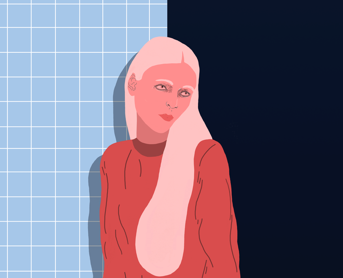
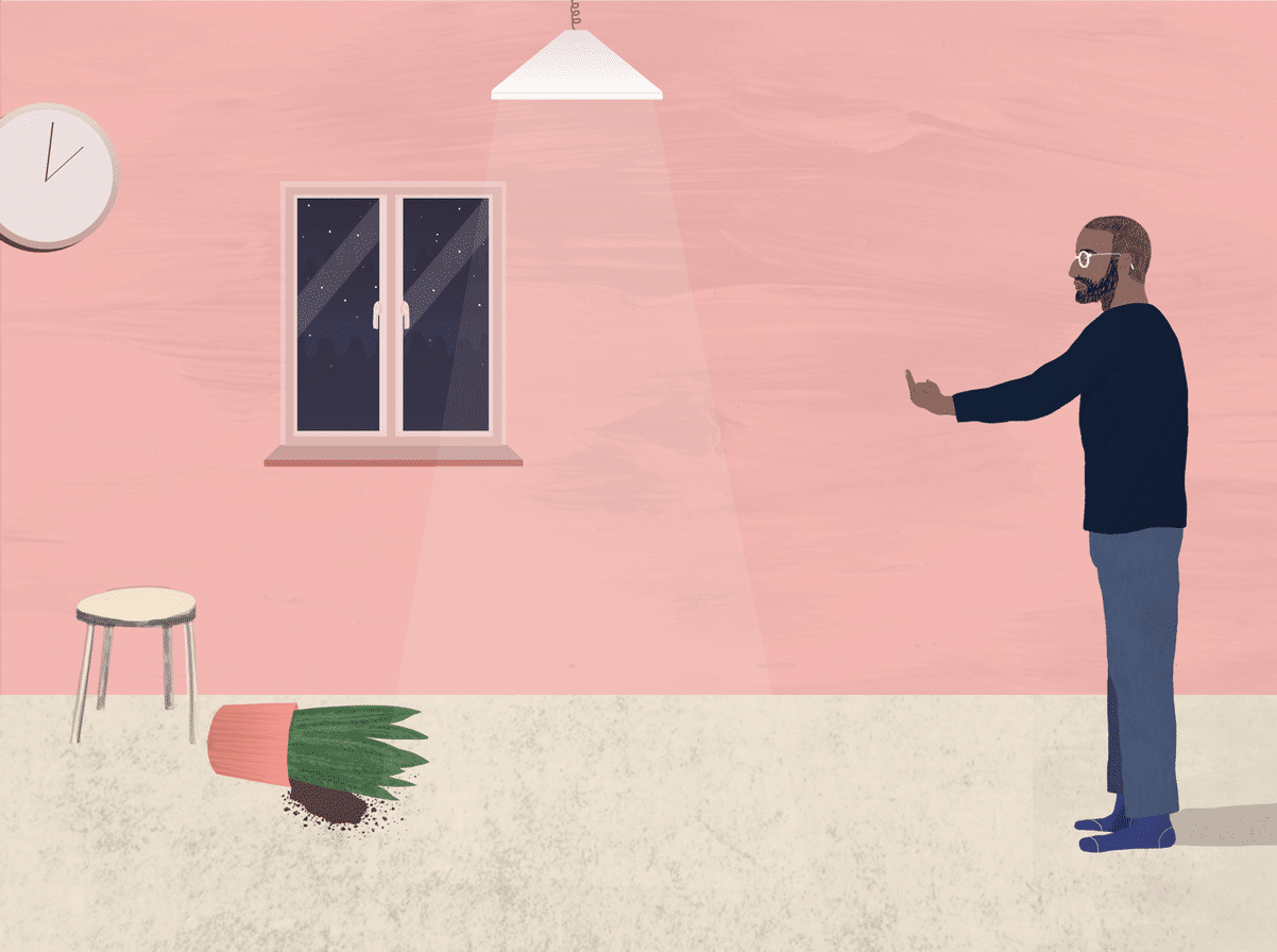
“Choosing what colors to use on an illustration used to stress me out because I would get so hung up on them being realistic and perfect.”
George Morton (@georgemortonillustration) was beholden to color. Then one day he threw caution to the wind and started experimenting with bold, clashing tones that disrupted his subject matter.
The approach stuck, and since then his singular eye has led to collaborations with the likes of Pitchfork, Condé Nast, and more. Below he tells INTO about his creative process, how his sexuality influences his work, and his plans for the future.

Tell me a bit about yourself and how you became an illustrator?
I’ve been drawing for literally as long as I can remember and never really had much interest in doing much else, so it kind of made sense. I remember being at art school and my teacher telling me that you could do a degree in illustration, and that was me decided then and there.
I studied at Cardiff School of Art & Design before moving to London, where I’ve been for the past three and a half years. I now work at a design agency but spend most evenings working on my illustrations and watching reruns of Gilmore Girls.

How is your work created? What tools do you use?
I always try to keep some sort of handmade element in every piece I do, whether that’s a texture or the actual base drawing. I usually start off with a rough pencil sketch to determine the layout and proportions before either making a more worked-up pencil drawing or scanning the rough in to work straight on top of in Photoshop.
I’ve gradually started building up a library of textures and patterns I’ve made too, which I can then pick and choose from to use in my illustrations. I also recently bought an iPad Pro, so I’ve been trying to get to grips with using that for my illustrations as well as my usual Macbook/tablet combo.
Had you experimented with other styles/tools before?
When I was at university they were really big on us experimenting with loads of different mediums and materials, which was great because it meant I got to work with paint, print, and ceramics a lot. However they weren’t so keen on us using digital programs to create work, so I’ve gradually taught myself and introduced these into my work.
I really enjoy painting and drawing, but working digitally works well for me because I tend to change my mind a lot and am a bit obsessive when it comes to details. It allows me to make mistakes and try out lots of different colours and layouts without having to settle on something straight away.

What other artists have inspired your aesthetic?
As I get older I’m finding a whole new level of appreciation for the artists we were made to study extensively at school. I hated Keith Haring and David Hockney’s work when I was 15 but now I can’t get enough of them. I actually managed to make it down to the huge Hockney exhibition at the Tate Britain on it’s last day, and it was just amazing seeing all his pieces in the flesh.
I spend a lot of time looking at photographic work too, especially fashion photography. I’m also just constantly on the lookout in everyday life for anything that could translate into an idea for an illustration, whether that’s someone with a strong choice of shirt or just a good color combo I could use.
Are there any recurring themes in your work or things you love to draw?
I used to hate drawing people more than anything, but I knew that as an illustrator there was probably only so long I could go without having to draw a person. So I forced myself to draw them as often as I could and also started going to life drawing classes a lot. Gradually I’ve grown to hate them less and less and now I pretty much only draw people.
Where has your work taken you and what opportunities have come from it?
One of my favourite opportunities recently was working with Pitchfork on some illustrations inspired by iconic albums. I produced 3 pieces for them which are now displayed in their shiny new offices in the One World Trade Center. For me it’s satisfying seeing such an iconic building and knowing that my work is somewhere inside it.
I also got the chance a few years ago to contribute a design to Secret 7″ and had my piece exhibited next to one by Gilbert and George, which was pretty cool.

Explain to me how you use color in your work, and what colors mean to you.
Choosing what colors to use on an illustration used to stress me out because I would get so hung up on them being realistic and perfect. One day I got so fed up with a piece I was working on that I just tried out using really bright, clashing colours that I would never have normally used. There was something about how it transformed the piece completely that I loved, and I’ve been doing this ever since. It’s really changed the way I work and allowed me to have a lot more fun with my illustrations.
What are you working on now?
I’ve got a few fun editorial jobs in the mix and am just generally trying to work on as much as I can, whether commissioned or personal. My boyfriend has been back home in Australia for the past couple of months which is rubbish but has meant I’ve had loads of time to work on illustration projects, so I’ve been especially productive recently!

How does being gay influence your work and what you draw?
I’ve never really thought about it but I guess the biggest influence being gay has had on my work is that coming out, I gradually realized that I shouldn’t get so hung up about what other people think and just concentrate on myself. I think this comes through in my illustrations somewhat, as I now just do the kind of work I enjoy doing and don’t think so much about anyone else when I’m making it. It would actually be really interesting to be able to see what kind of work I’d be making if I had never come out.
Where do you hope your work will take you?
One day soon I’d love to be able to make the switch to just doing illustration for a living and hopefully even travel a bit more, but London is crazy expensive to live in, which makes things tricky. That’s the first big hurdle I guess, and I’ll focus on some bigger ambitions once I’ve checked that off my list!
What’s your dream commission?
I’ve always wanted work on an album cover. Album artwork is probably one of my favourite kinds of design, as it can have such a huge influence on how you interpret the music. I love the idea of having my work preserved in that way.

Don't forget to share:
Help make sure LGBTQ+ stories are being told...
We can't rely on mainstream media to tell our stories. That's why we don't lock our articles behind a paywall. Will you support our mission with a contribution today?
Cancel anytime · Proudly LGBTQ+ owned and operated
Read More in Culture
The Latest on INTO
Subscribe to get a twice-weekly dose of queer news, updates, and insights from the INTO team.
in Your Inbox


