I’ve always been obsessed with Disney villains. Ever since I was a kid, I was obsessed with the preening, queenly presences of characters like Jafar, Maleficent, Ursula, and Captain Hook. They just seemed so self-assured, independent, hilarious, and interesting, unlike the…you know…other characters, who just kind of sit there.
There’s something else that’s interesting about the Disney villains: their character design. While Disney heroes are defined by either a concave stomach (for girls!) or six-pack abs (for boys!) the villains get to have bodies that stand outside of the presumed “ideal” for their gender. Ursula is a fat witch who loves her body and takes pride in being a woman of size. Maleficient is tall and arrow-like, with cheekbones that could literally cut you in half. And Jafar kind of wears a corset? That, or a very early prototype of KKW Skimwear. And the evil queen from Snow White? That lady wears a headscarf 24/7! It’s a bold, amazing fashion statement and I love it.
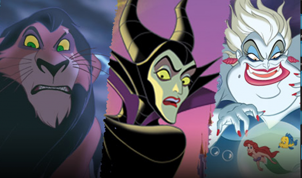
Even the animals have a different design: Scar, Simba’s evil uncle in the lion king, looks emaciated and rakish, as if the animators found a way to make a lion look convincingly like a waifish Victorian gentleman. And he’s got these flashing green eyes that you just notice.
The villains look different, and they move differently. There’s a fluidity and a lugubriousness to the way they make their way around the world. As scholar and queer historian Matt Baume has wonderfully pointed out, all this is explicitly queer coding, whether or not the original creators intended it.
Watching Baume’s video the other day, I noticed something else interesting about the way our favorite queer-coded villains are designed: they all give flashes of green, either in their eyes, their clothing choices, or in the case of Maleficient, their entire face.
So let’s rewind all the way back to the Victorian era, where the color green starts to play a large role in gay culture.
You might think it’s just an arbitrary choice on the part of animators trying to create visual cohesion at one of the world’s largest animation companies. But there’s a not-so-secret history regarding gay coding and the color green that bears mentioning here.
So let’s rewind all the way back to the Victorian era, where the color green starts to play a large role in gay culture.
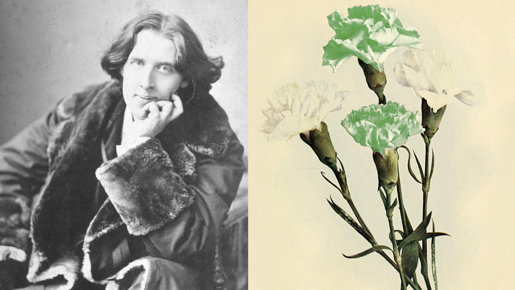
In June of 1890, a magazine called Lippincott’s Monthly published a shortened version of Oscar Wilde’s The Portrait of Dorian Gray. The infamous story about a young man who makes a Faustian pact to remain forever young was instantly both celebrated and decried as immoral, creating a succès de scandale that Wilde himself enjoyed. The book took pains to drop hints about Dorian’s sexuality, not just through suggested sexual encounters with other men, but through specific language and coding. Wilde had gotten used to doing this in his earlier work. His entire career, before he got seriously into playwriting in the mid-1890s, was devoted to exploring gay themes without being able to call them gay. Because at the time, famously, sodomy was a crime punishable by years of hard labor and resultant death. Just one year before Dorian Gray was published, British cops busted a male brothel on Cleveland Street in London, exposing several high-ranking figures such as Lord Arthur Somerset as “inverts,” or men who had sex with men. It was even rumored that certain members of the Royal Family paid a visit to Cleveland Street, though this was never confirmed. The scandal created a renewed public interest in punishing what society saw as sexual deviants. It set the stage of the intensely punitive, homophobic atmosphere into which Wilde was about to debut his extremely coded queer plays and fiction.
So what did Wilde do to show audiences that Dorian Gray was “one of us?” He used the color green.
“He had that curious love of green,” the narrator explains, “which in individuals is always the sign of a subtle artistic temperament, and in nations is said to denote a laxity, if not a decadence of morals. ”
This idea didn’t come out of nowhere: in the Victorian era, the color green was connected with disease and death, for a sort of good reason. Green dyes in the Victorian age could actually kill you, due to a particularly bright strain of dye that was manufactured with arsenic, causing women in green dresses to intermittently pass out and develop horrifying skin conditions. The Victorians believed in the power of color and language: this belief led them to create the language of flowers, which tied a specific message to each type of flower and each color associated with it.
This brings us right back to Wilde, whose obsession with the color green is well documented. His 1889 essay, “Pen, Pencil, and Poison,” was subtitled “A Study in Green.” It covered the life and times of the poisoner Thomas Griffiths Wainewright, explaining how the color green played a part in his life and work. Not only did Wilde used the same quote about green-as-decadence as the one that would be borrowed for Dorian Gray the next year, he went on about the function of green as it relates to the “artistic” temperament in Emile Zola’s work:
“M. Zola, in one of his novels, tells us of a young man who, having committed a murder, takes to art, and paints greenish impressionist portraits of perfectly respectable people, all of which bear a curious resemblance to his victim.”
Wilde was also a fan of Huysman’s “A Rebours,” or “Against Nature,” a seminal text of the decadent era that ends with the main character painting his room black and affixing gemstones to the shell of his turtle. Yeah, it’s a weird one, but it’s worth a read. Wilde loved the book so much, he explicitly referenced it as a “poisonous yellow French book” in Dorian Gray, creating a scene where the older Lord Wotton passes the book to his young charge and instantly “corrupts” him.
Now, an important thing to remember about Wilde: when he talks about “the artist” or the “artistic temperament,” he’s 100% using “artist” as a stand-in for “gay.” He was able to write essays, dialogues, and treatises on characters who would debate the role of morality in art and whether or not “morals” should play a role at all, and usually Wilde comes down on the side of “artists can do whatever they want.” He was waging a war against morality because his society was still coupling murderers and rapists with gay people, and putting them under the same, sick, sad umbrella.
Green is a signifier and a symbol, and Wilde found a way to remove the idea of green as decay and death, making way for a more interesting interpretation.
So in discussing the virtues of a poisoner or an artist who took things a little too far, he’s often trying to make a case for art as a realm separate and apart from traditional morality. And green helps a lot with making this case. It’s a signifier and a symbol, and Wilde found a way to remove the idea of green as decay and death, making way for a more interesting interpretation.
Wilde famously took his love of green one step further, by wearing a dyed-green carnation to the 1892 opening of “Lady Windermere’s Fan” and coaching his male proteges to do the same. The idea caught on, and quickly became a symbol for queer decadence. In 1894, a year before Wilde was about to be sent to trial for “gross indecency,” a writer named Robert Hitchens wrote a book based on Wilde’s relationship with his boyfriend Lord Alfred Douglas. Its title? The Green Carnation. I have read it, and it’s basically 250 pages of someone being really mad at Oscar Wilde for being hot and having game.
Green is also the color of jealousy, Robert!
The Victorians were famously sex-phobic, going so far as to believe that masturbation was a kind of madness that required intense clinical treatment. The fear of sex in the culture–for both straight and queer folks–was intense, leading to a kind of obsessed fascination with the horrors of sex and the diseases that could result from it, like syphilis and gonorrhea, which at the time were very painful, not easily cured, and could end up basically driving you insane if you caught a bad case. So yeah, people were freaked out of all kinds of “immorality.” You probably would be, too, if you thought you could catch a life-altering STD by just looking at someone across the vestibule.
Sadly, the color green’s legacy has remained hidden. But every so often, the gay connotation will re-surface. Think about the Wicked Witch of the West, played by the wonderful Margaret Hamilton (definitely a lesbian, IMHO) with her face painted Emerald Green, or the sapphic-coded Poison Ivy.
Or those Disney villains, in whom you’ll always see a flash of emerald green, reminding you that queer coding lives fucking forever.
Because we live forever. ♦
Help make sure LGBTQ+ stories are being told...
We can't rely on mainstream media to tell our stories. That's why we don't lock our articles behind a paywall. Will you support our mission with a contribution today?
Cancel anytime · Proudly LGBTQ+ owned and operated
Read More in


The Latest on INTO


Subscribe to get a twice-weekly dose of queer news, updates, and insights from the INTO team.
in Your Inbox